ORIGINAL LAYOUT
This was the bathroom design we were given to work with.
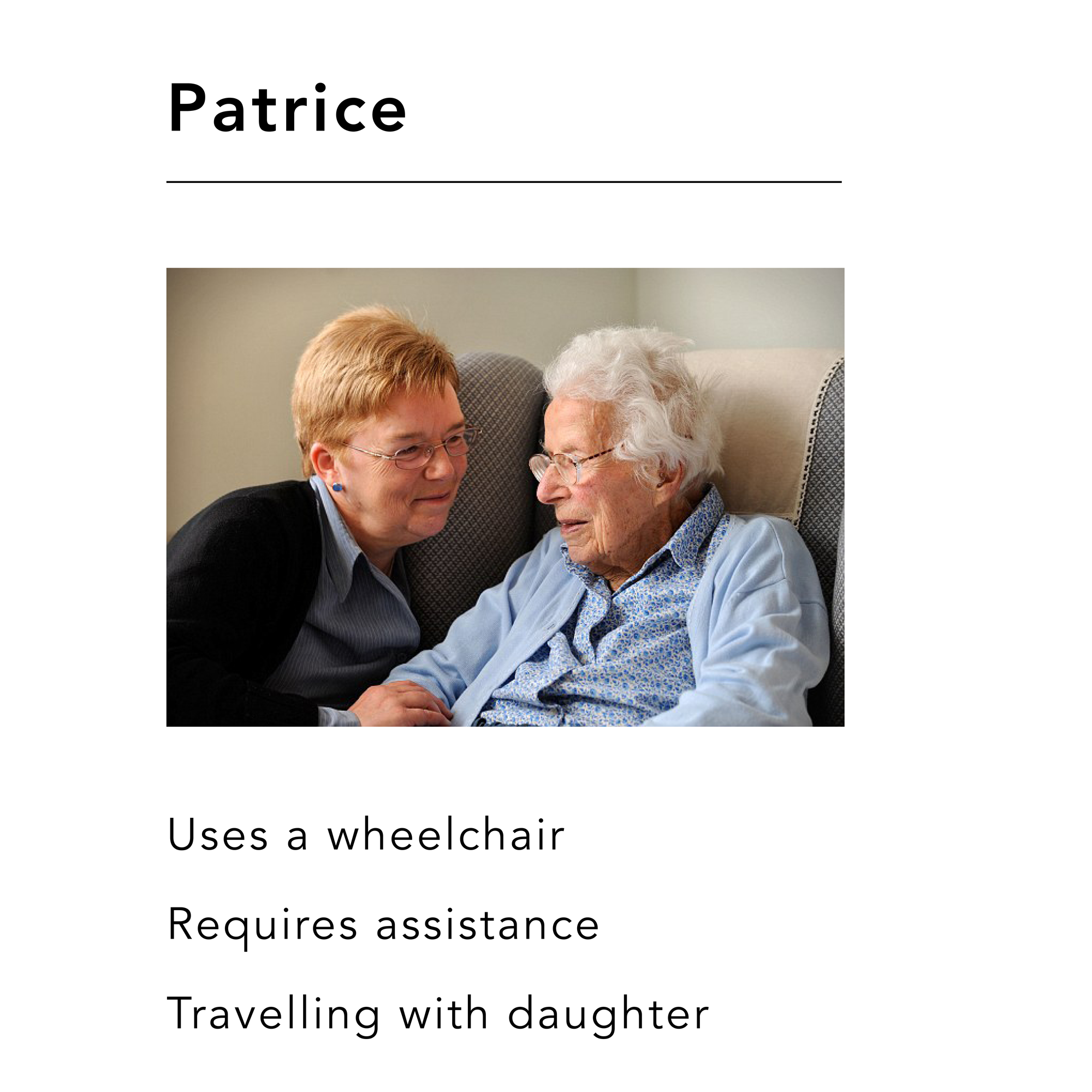
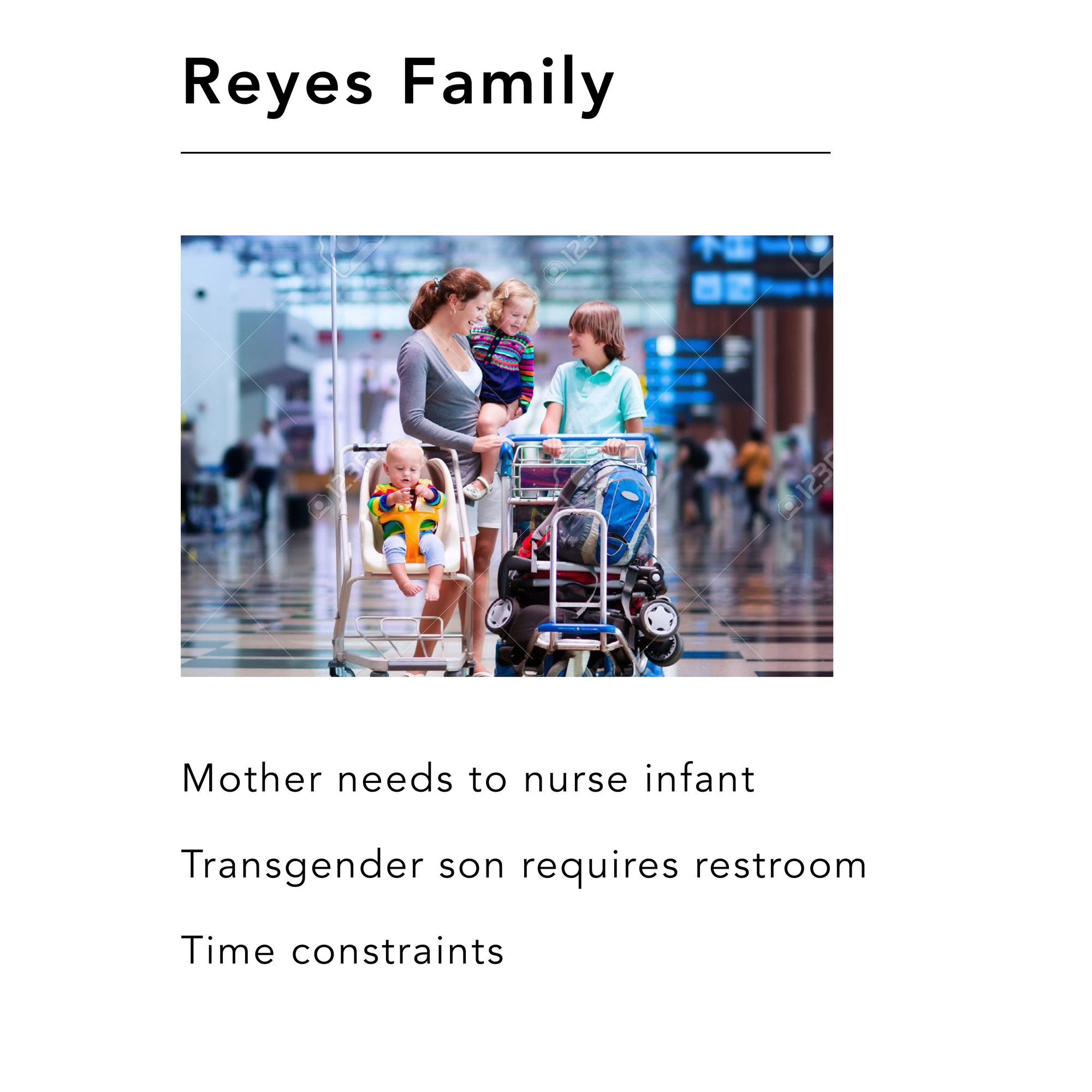
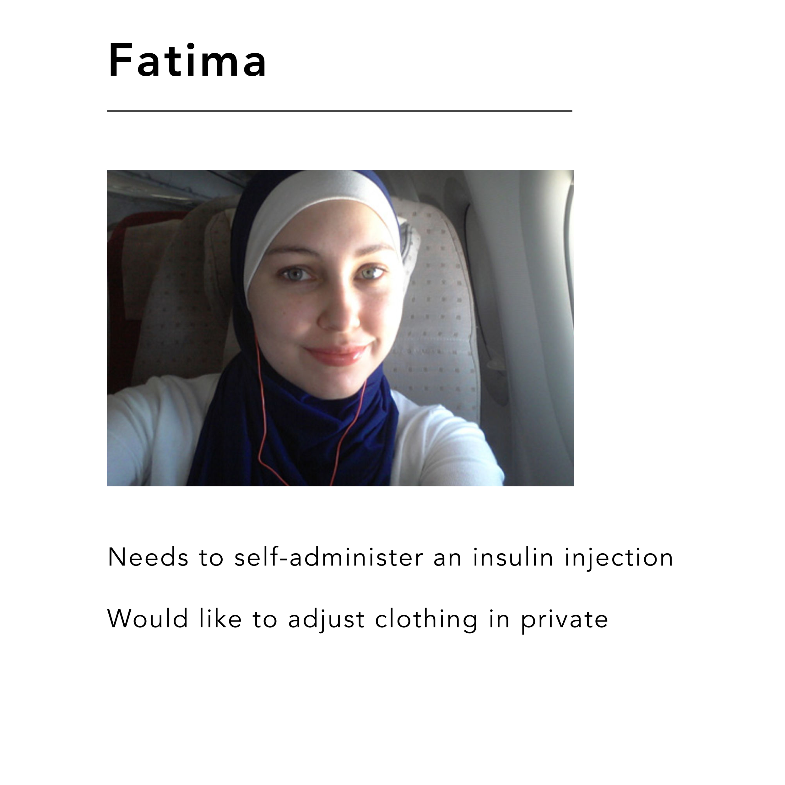
USER PROFILES
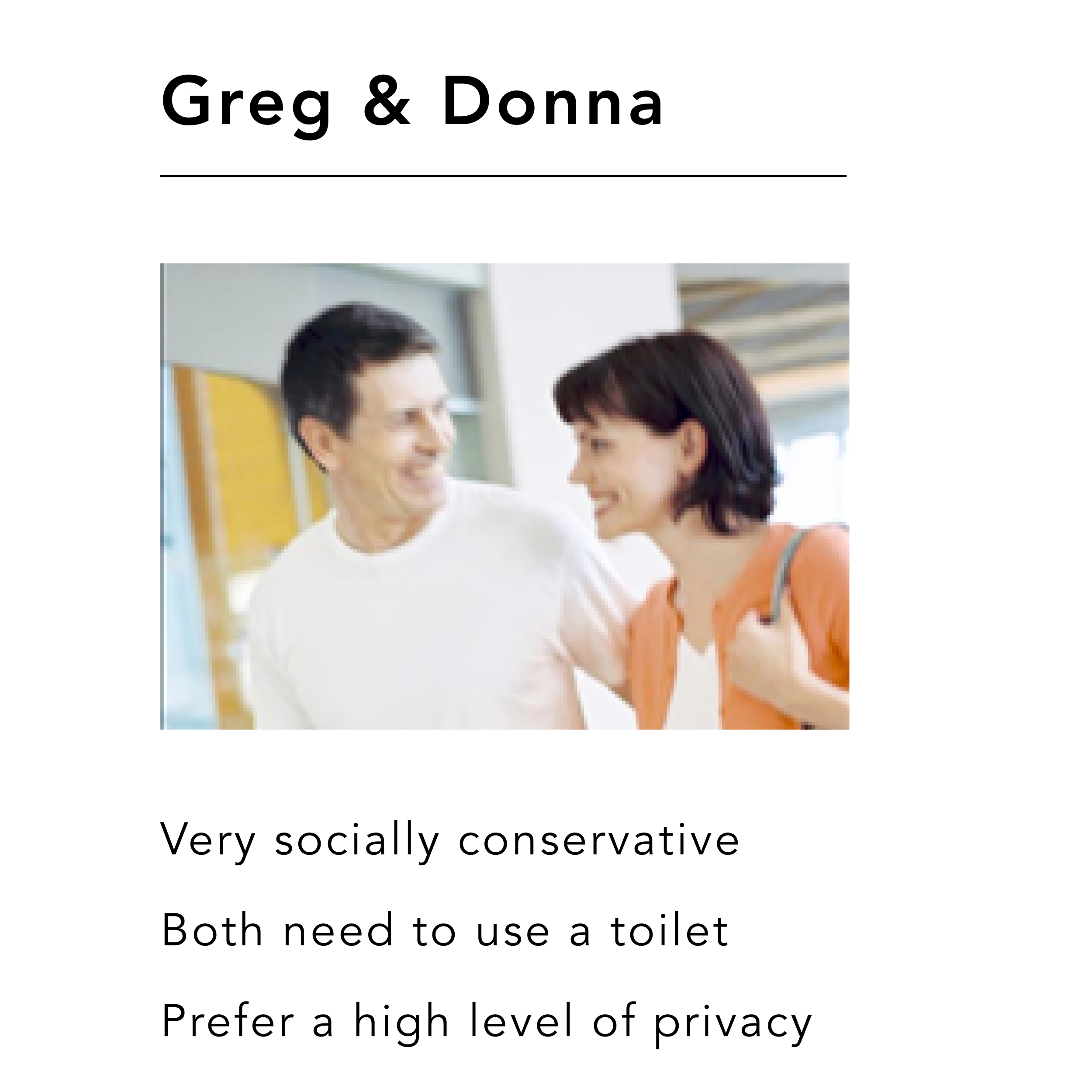
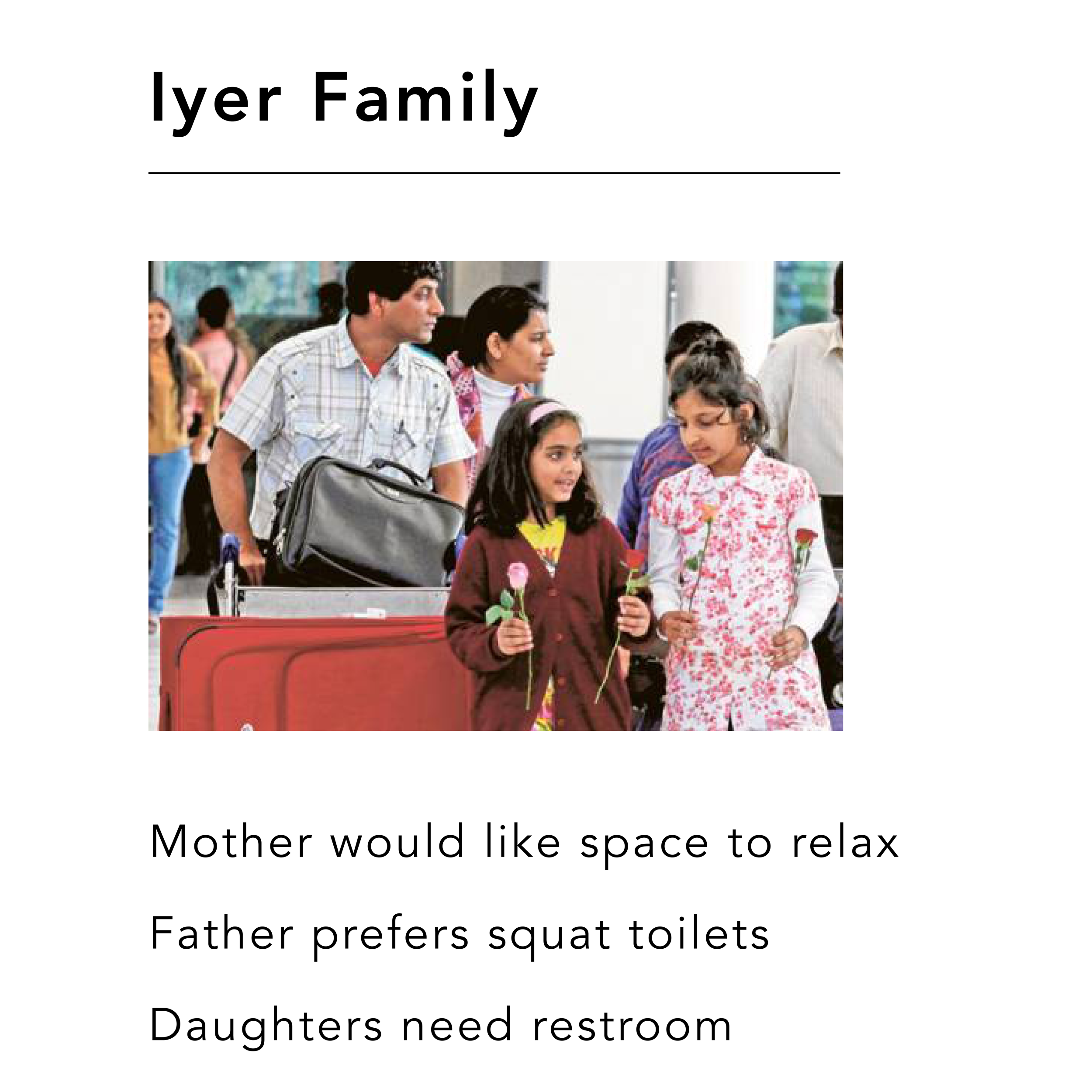
structural revisions
SIGNAGE
STYLE
ICONOGRAPHY
WALL PLAQUE
SUPERGRAPHICS
SeaTac all-gender bathroom redesign
In this project, my partner and I explored the UX of the bathroom, attempting to create a space that was as accessible and user-friendly as possible. We designed signage, iconography, environmental graphics, and structural changes to a proposed all-gender bathroom at SeaTac Airport. (Proof of concept)
Timeframe
Eight weeks
Roles
UX designer, visual designer, production, research, creative direction
Partner
Amy Ray
Skills
Research
Iconography Design
Visual Design
Environmental Graphic Design
Environmental UX
UX storytelling
Software
Illustrator
Rhinocerous
InDesign
Photoshop
Challenge
Working with an existing architectural structure, design an all-gender bathroom suitable for an international airport in the United States that feels intuitive and comfortable for people of all social and political beliefs, linguistic backgrounds and gender identities. Improve and reimagine our expectations for bathroom function and usability.
Project background and description
This was an environmental graphics assignment which my teammate and I chose to approach from a UX standpoint. While the assignment only called for us to design graphics that would assist users in navigating the space, we chose to make structural changes to the space to improve its function and usability as an accessible, all-gender bathroom.
Project goals and objectives
Improve circulation
De-gender the space by emphasizing function over preferred user
Create icons that are legible across language barriers
All text is in two languages + braille
Maintain or improve sense of safety and privacy
Establish hierarchy to channel users into correct areas
Maintain or improve ADA accessibility
Do not make users feel that a values system is being imposed on them
Process
Researched existing all-gender bathrooms and found that an effective design solution has been to increase the privacy of the stalls within the all-gender space by lengthening the doors and partitions to extend to the floor - eight feet high
Researched iconography that represented the utilities in the space rather than the intended user of the space
Researched squat toilets and common symbology
Researched ADA specifications for signage, sink heights, turning radius, and braille
Created user profiles that included users who required sharps disposal, trans people, people in wheelchairs, people who required assistance, and users uncomfortable with the concept of an all-gender space.
Calculated decision points, circulation paths and viewing distances for each user
Created iconography based on established design schema
Selected gender-neutral colors that were accessible for color blind users
Built a 3-D model of the space using Rhinocerous
Used Rhino to create 3-d mockups with users to scale
Created a space that works with or without text; the icons are so clear that a user would be able to navigate the space without reading anything.
Solution:
Improved privacy and gender integration
Connected toilet and urinal restroom areas by removing stalls along back wall.
Urinals partitions replaced with stalls for improved privacy
All stall doors start at floor and are 8’ high for privacy, security, and circulation.
Private room wall height is 9', leaving a 3’ gap at the top for circulation.
Improved ADA accessibility
All toilet stalls are ambulatory-accessible with handrails. Easier for anyone able to self-assist in a non-ADA stall.
Signage for ADA-compliant restrooms highlights multifunctionality: for all assistance situations and any need or preference for a larger, isolated restroom.
Improved UX for non-literate and ELL users
Hanging signs featuring icons near entrance areas, visible from the main circulation area.
Icon-based supergraphics on entrance area walls are simple and clear, helpful regardless of primary language.
Toilet or urinal icon on respective stall doors.
Each private room has all relevant icons on its door, in addition to an outer wall sign in English, Spanish, and braille.


