BITBONDER: MAKE ANYTHING
Product pitch for Seattle Central Creative Academy
By Wynn Barnard, Amy Ray, and Kaitlyn Castellow
BitBonder is a STEM app designed for girls ages 10-14. Through addictive puzzle games and social sharing, players earn elements in the periodic table and use chemistry fundamentals to build real-world items. The overarching goal is to create positive associations with chemistry and science as a whole, and to build confidence, interest, and familiarity. (Proof of concept)
Timeframe
6 weeks
Roles
Creative Director
Storyboard Artist
Animator
Illustrator
Partners
Amy Ray
Kaitlyn Castellow
Tools
Adobe Illustrator
Adobe After Effects
Challenge/Problem
Women are underrepresented in science, technology, engineering, and mathematics (STEM) fields. Gender-biased academic expectations, lack of exposure to STEM fields, a dearth of confidence and representation, and at times explicit discouragement are all contributing factors.
Concept
Create a game that encourages girls to engage with STEM in a way that integrates into their social sphere.
Solution
Of the numerous STEM subjects we could have chosen, chemistry was a stand-out as a particularly abstract and often alienating secondary school subject. Furthermore, the size, variety, and uniformity within the periodic table as an informational structure lends itself to scalability and an enjoyably repetitive, comprehensive pattern of gameplay.
how to play
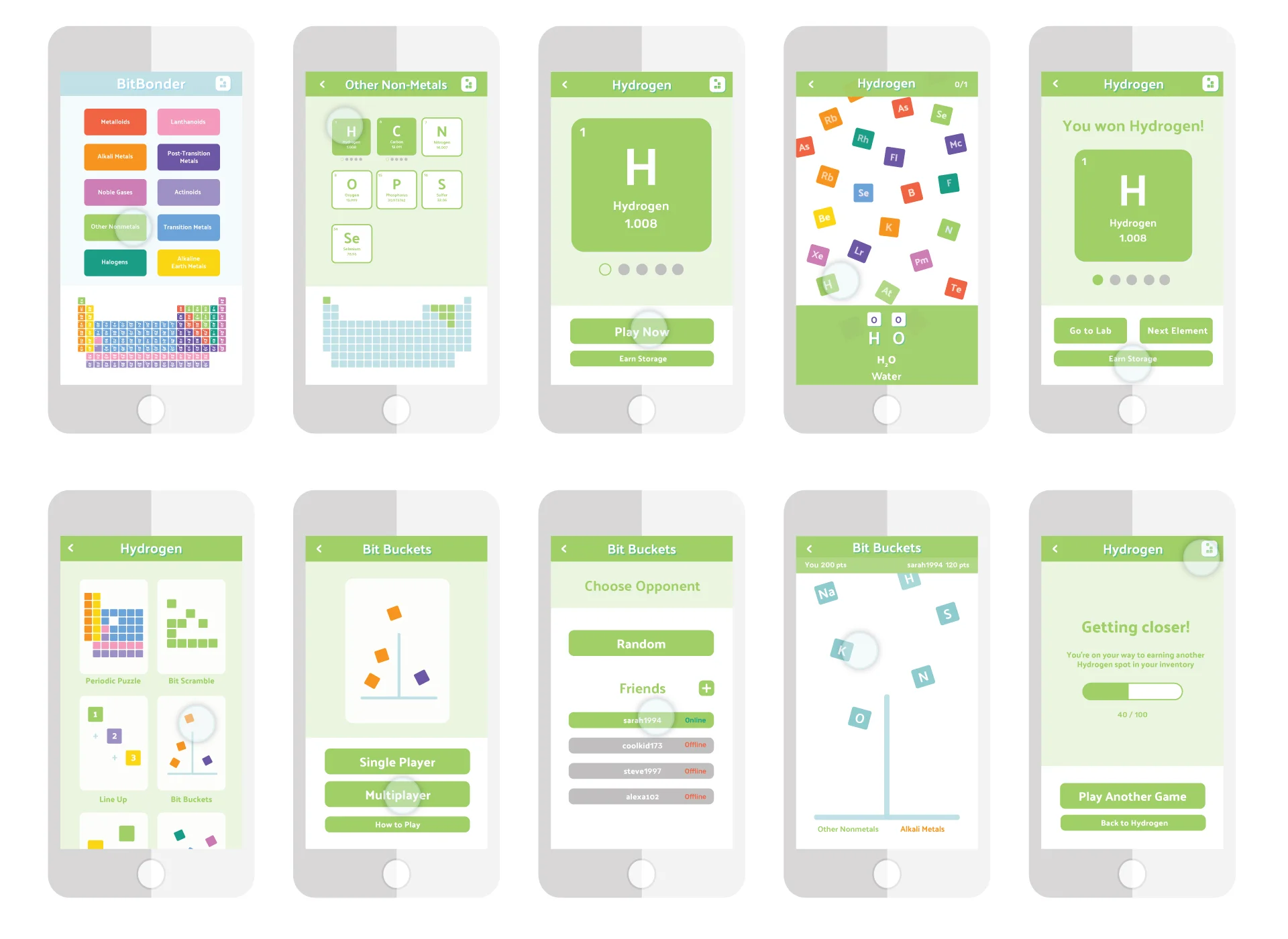
User learns about the periodic table and the elements within it by first selecting a category to explore, such as Noble Gases or Other Non-Metals. Elements that are a solid color are available to play, and dots below them indicate how many of each element the player have earned and have the potential to earn.
User starts a game by tapping “Play Now” to build molecules that use the element they've chosen. Main gameplay consists of a series of falling blocks, each of which represents an element from the periodic table. At the bottom of the screen, a molecule is visually represented which contains the element you've chosen to play. In the example below, the user has chosen Hydrogen, and the molecule represented is water. The player identify and tap the correct elements as they fall, and do so enough times to successfully build the molecule. In this example, the player must tap two falling Hydrogens and one Oxygen. Once they've done so, another molecule will populate, until they've successfully earned a new spot for Hydrogen in their inventory.
Once the player earns an element they can play for another one, go to the lab to see what they'd like to build, or earn extra storage spots by playing a mini-game such as Periodic Puzzle or Bit Buckets. Play by yourself or against another person!
the lab
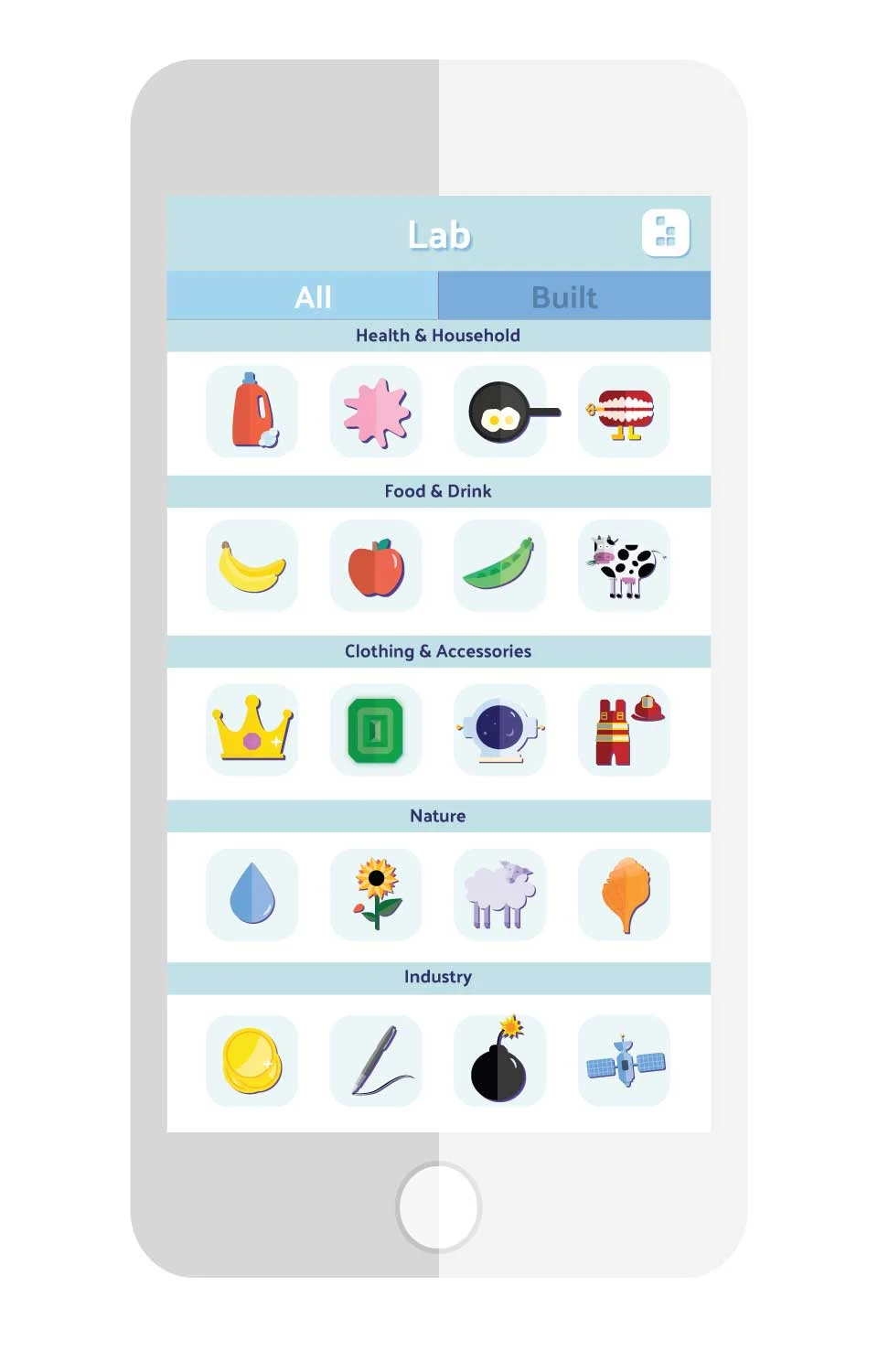
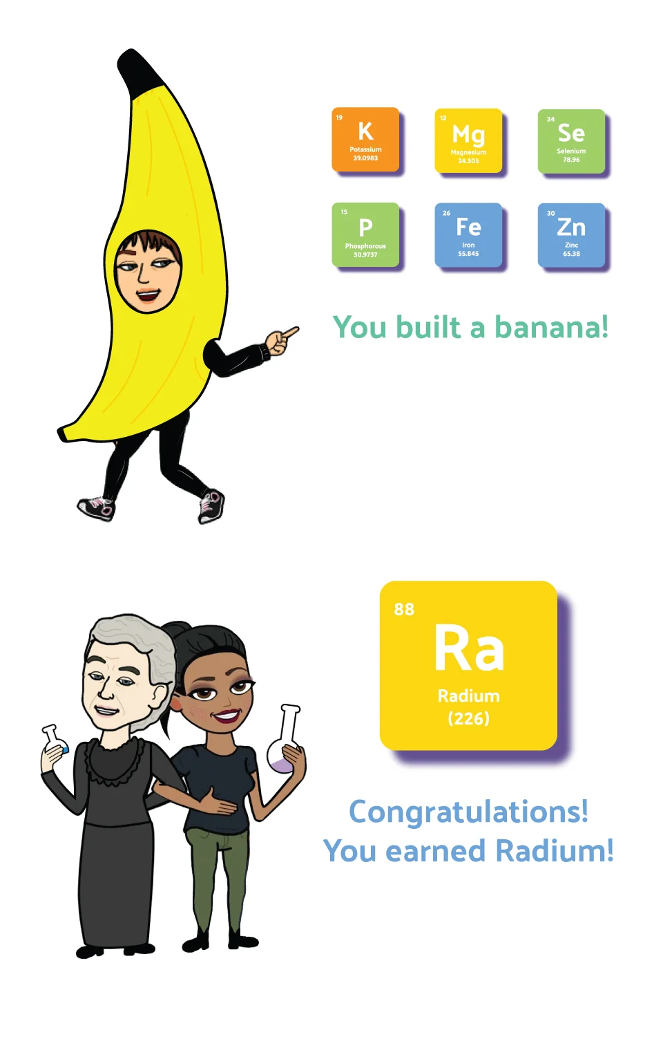
In the lab players can build something new with their earned elements or review what they've already made. As they earn elements, players earn corresponding stickers which populate as a keyboard in their device's texting application. Stickers typically feature real-world items which can be made using the earned elements - such as a cow to represent Calcium-rich milk, or a banana to represent Potassium. Occasionally, players earn stickers featuring famous female scientists who discovered elements in the Periodic Table. For example, when a player earns Radium, they receive a sticker featuring Marie Curie. If the player uses Bitmoji on their device, these stickers will populate their Bitmoji keyboard, featuring the user with the famous female scientists they've earned.
Players keep their inventory stocked by continuing to engage with the game. With decreased use, they will lose access to stickers, encouraging repeated and regular gameplay.
SOCIAL SHARING
PROCESS: VIDEO


process: game design
INITIAL RESEARCH
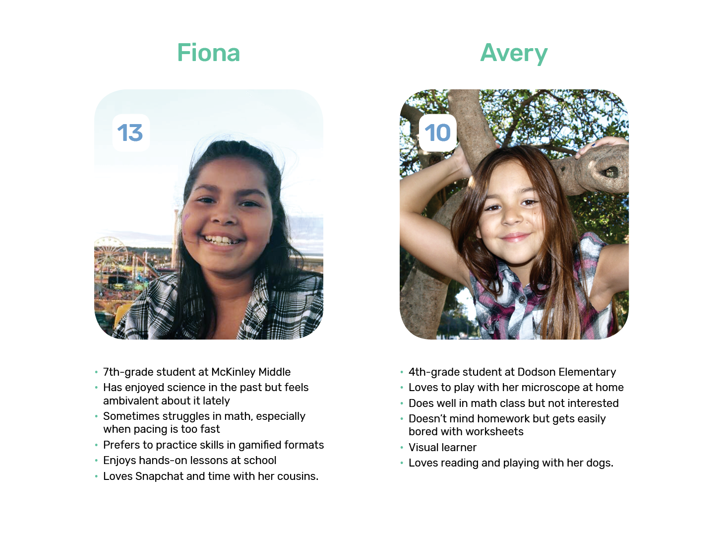
Our discovery and research phase included reading literature about how children learn and underrepresentation of females in science fields, both STEM and non-educational but popular app reviews, and interviewing women outside the target age-range. We also looked at the user interfaces of existing games and found that typically employed dark colors and were masculine-leaning with little personality or real-world connection. This helped us establish that our app must be fun and educational, integrate into middle school social life, and connect subject matter to real world applications. With this in mind we created a preliminary moodboard to direct our visual style for color, illustration and typography, and personas to help us stay focused on user needs.
USER INTERFACE DESIGN
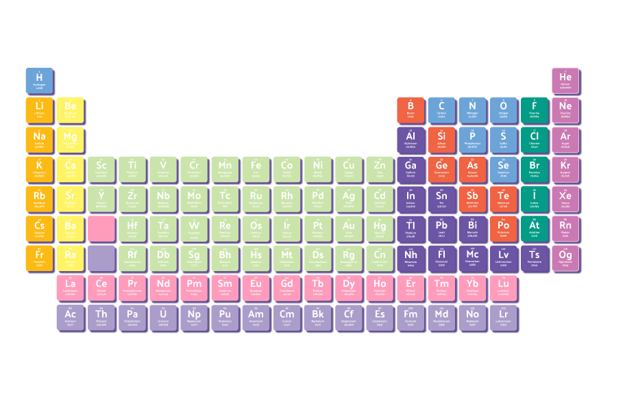
I designed this periodic table with the goal of creating something that appeared tactile, bite-size and delicious. Careful consideration went into color coordination, selecting colors that were at once visually distinct and harmonious. We were also careful to keep our palette somewhere between gender-neutral and feminine-of-center.
I produced several rounds of iterations for my team. We used these to guide our discussions regarding the relationships between shape, color, speed, tactility, learning and retention. After refining our design, we chose to move away from the visual metaphors of circles and atoms, and toward falling squares that had a more direct visual relationship with the 'pieces' of the periodic table. Once we reached this point in the evolution of our visual style, the cohesion and clarity of our gameplay metaphor drastically improved.
After establishing a visual style for gameplay, we considered how color would play into the rest of our UI. This presented a certain level of challenge; our choice to organize the periodic table by color meant that we were working with a broad palette and that color had to be used intentionally. We determined that user ease would be maximized and information would be most strongly reinforced if the the color connection between elements was maintained throughout the game. So, when a player earned a molecule from alkali metals, for example, they would then build a molecule and examine their inventory in a UI that corresponded with the color of alkali metals on the periodic table.
ILLUSTRATION style
I was tasked with establishing our visual style. After working as a team to research and identify a preferred illustration style (flat, vector illustration style featuring friendly, quirky imagery) produced the illustrations below as a starting point. We were then able to create a style guide and rapidly produce assets as a team.
STYLE GUIDE


User Profiles
LO-FI WIREFRAMES


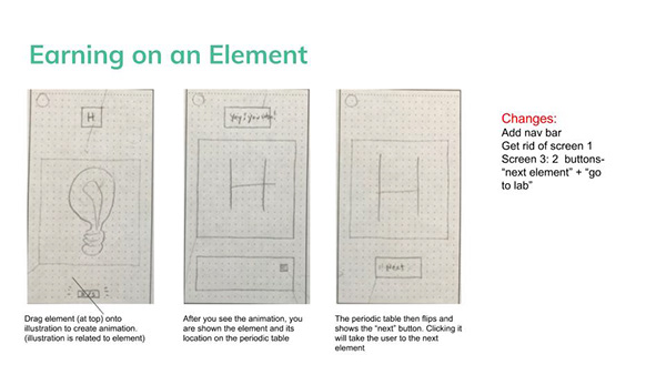


First round of wireframes established the basic functions and relationships of each game component
WHITEBOARDING
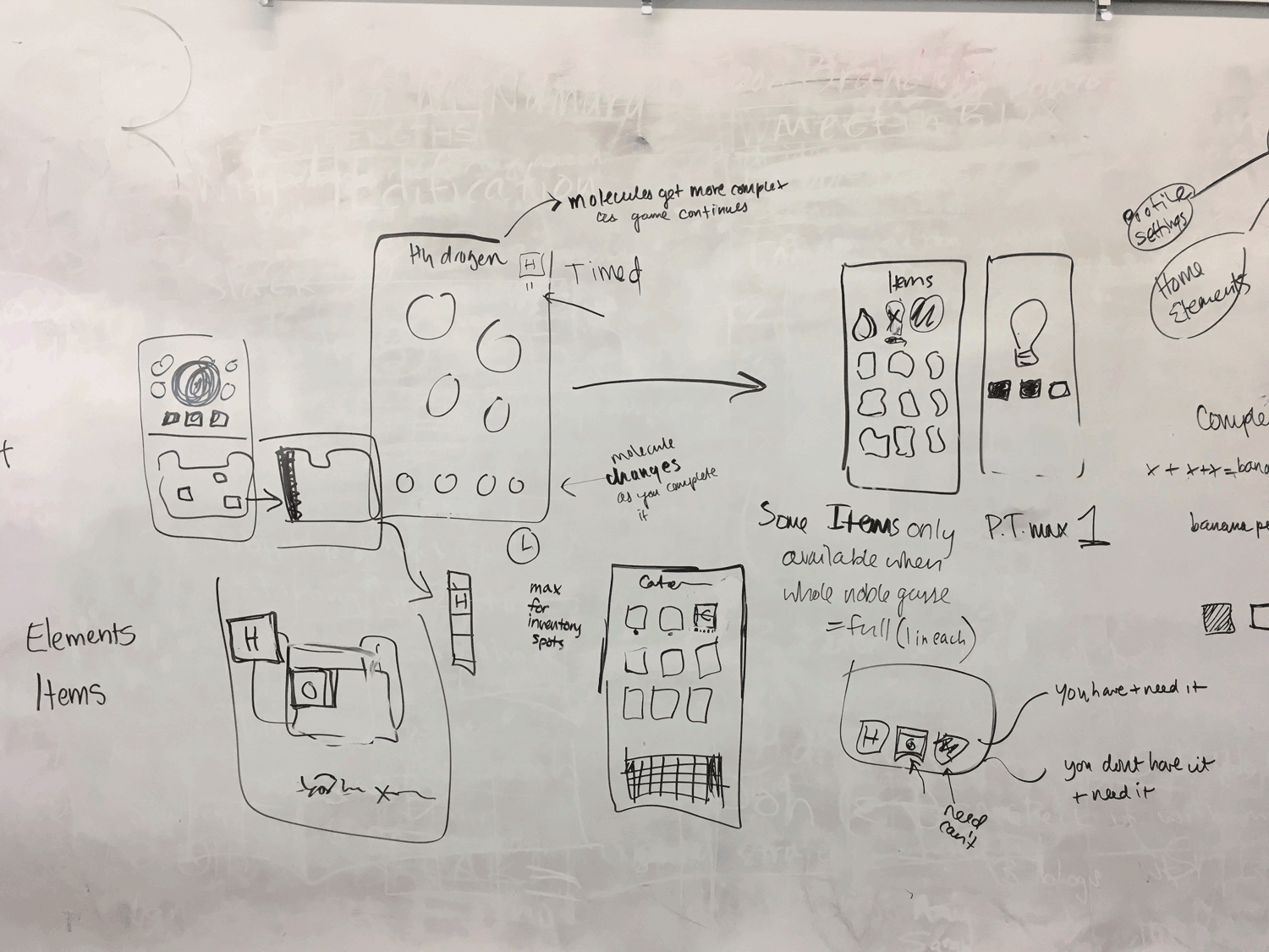

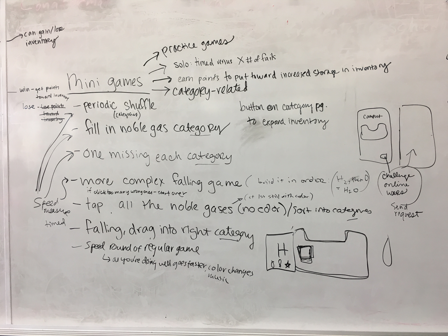
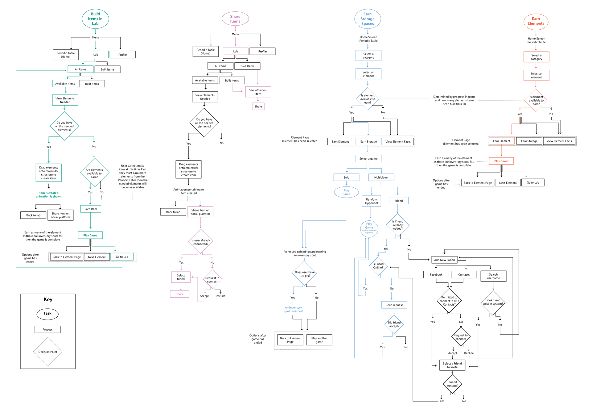
Whiteboarding sessions helped us determine accurate user flows
MORE LO-FI WIREFRAMES


REFINED TASKFLOW
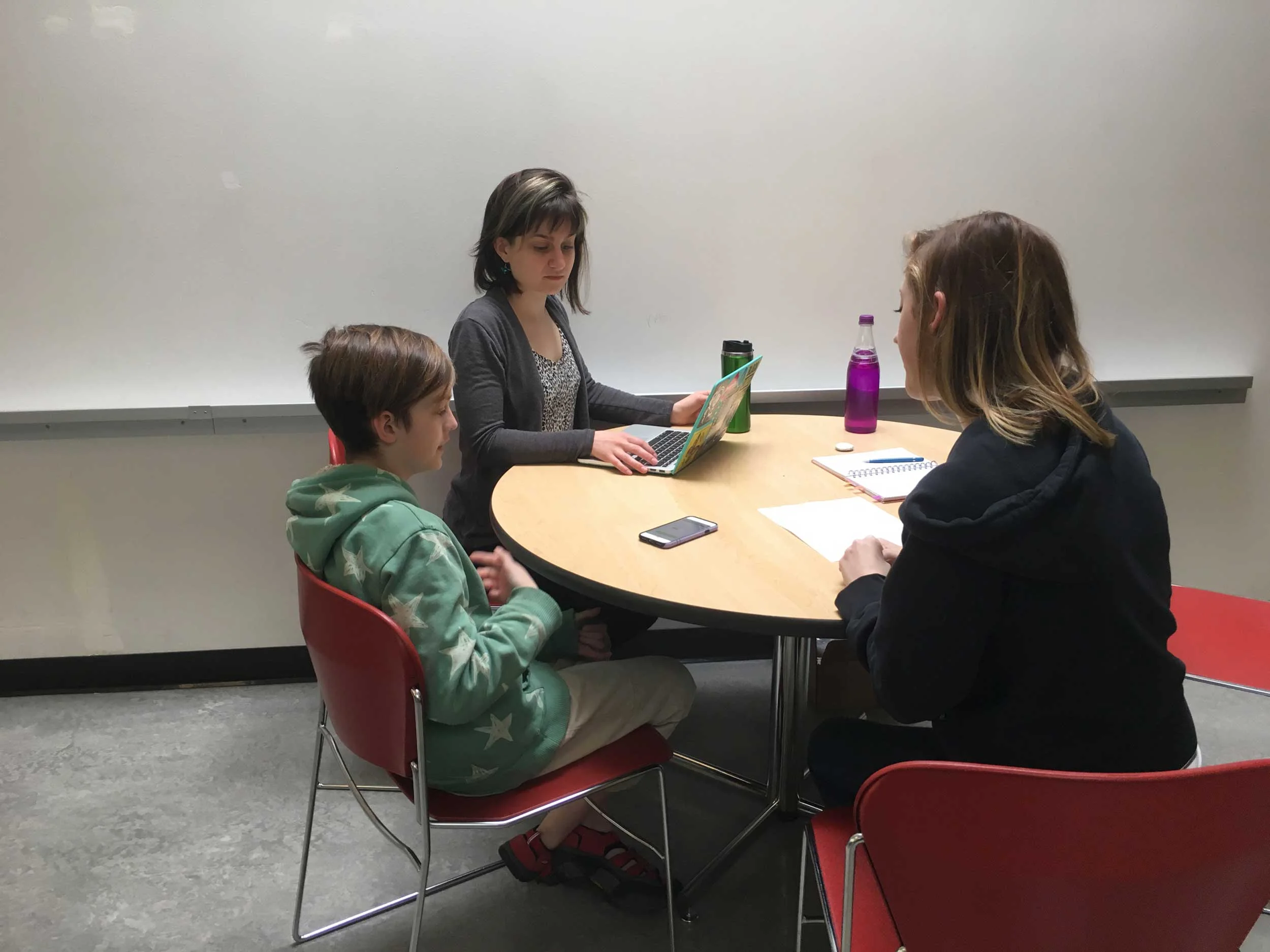
USER TESTING
After creating a rough UI using our established style guidelines and building a UX prototype, we conducted user testing with a real live middle school girl! Of course, we would have preferred to have a larger sample size, but due to scheduling constraints, we were only able to get feedback from one student. We were happy to receive mostly positive feedback from our user, with all critical feedback regarding clarity in our UI which was easy to resolve.

